Home
» Tips
»
Modern Real Estate Listing Presentation PowerPoint Template (Free): What to Include
Modern Real Estate Listing Presentation PowerPoint Template (Free): What to Include
A real estate listing deck can look expensive and still fail at its main job: helping a seller, buyer, investor, or internal team understand the property quickly. The usual problem is not PowerPoint itself. It is a presentation that mixes too many fonts, oversized paragraphs, low-value stock imagery, inconsistent property facts, and slides that do not follow a clear decision path.
If you searched for a modern real estate listing presentation PowerPoint template free, the most useful approach is to start with a clean, editable structure and then replace every placeholder with verified listing information. Microsoft confirms that PowerPoint can start from a blank presentation or a prepared template, and PowerPoint for the web can be used without installing desktop software. See Microsoft's presentation creation guidance and PowerPoint for the web guidance.
Important limitation: I did not verify an official Microsoft template with this exact article title. The slide structure below is therefore a free blueprint you can recreate in PowerPoint rather than a claim that Microsoft publishes a specific template under this exact name.
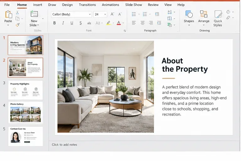
A modern listing deck works best when property photography, concise copy, and repeated slide layouts are treated as one system rather than separate design elements.
Why real estate listing presentations often feel cluttered
Listing presentations usually become messy for three reasons. First, they try to answer every possible question on every slide. Second, the photos are treated as decoration instead of evidence about the property. Third, branding changes from slide to slide because text boxes, colors, and image crops are adjusted manually.
The easiest fix is not adding more design. It is reducing the number of decisions the viewer has to make at once. A strong slide should usually have one primary message: the property at a glance, the strongest features, a room gallery, location context, market context, or the next action.
Start with the simplest improvement: fix the slide order
Before choosing colors or animations, give the deck a logical sequence. The following layout works well for many residential listing presentations and is easy to adapt for commercial property, rentals, or seller pitches.
Slide
Purpose
What to include
1. Cover
Create immediate context
Property name or address, one strong hero image, agent or brokerage name
2. Property snapshot
Answer the basic questions fast
Price, beds, baths, living area, lot size, property type, status where appropriate
3. Key features
Show the strongest reasons to care
Three to six verified features with short descriptions
4. Interior highlights
Let the photography do the work
Living area, kitchen, primary bedroom, bathrooms, distinctive details
5. Exterior and site
Explain the setting
Facade, yard, balcony, view, parking, building amenities, or site plan
6. Floor plan
Clarify spatial relationships
Legible floor plan or simple room arrangement graphic, when available and accurate
7. Location
Add geographic context
Map, transit, services, parks, or other neutral factual location information
8. Market context
Support pricing or positioning
Verified comparables, trends, or seller-approved market data with source/date
9. Marketing or next steps
Explain what happens next
Showing plan, launch plan, offer process, contact method, or call to action
10. Contact
Make follow-up easy
Name, brokerage, phone, email, website, required license details where applicable
If the deck is meant to win a seller's listing rather than market a specific property, replace several property-detail slides with your pricing process, photography plan, distribution strategy, showing process, reporting cadence, and proof of relevant experience. The visual system can stay the same.
Next, make the photos carry more of the presentation
Real estate is visual, but a slide with five equally sized images often feels weaker than one excellent image with one or two supporting details. Use the highest-quality property photography you are authorized to use, and avoid stretching a vertical image to fill a horizontal frame.
PowerPoint supports inserting images from your device and then resizing or positioning them. Microsoft's current instructions are available in Insert a picture in PowerPoint.
For screen-first presentations, a 16:9 widescreen layout is usually practical because it matches many modern displays, but it is not mandatory. Microsoft supports Standard 4:3, Widescreen 16:9, and custom sizes. If you are designing for a printed handout, a legacy projector, or a platform with another aspect ratio, set the slide size before doing detailed layout work. See Microsoft's slide-size documentation.
Then simplify typography and color
A modern real estate presentation does not require an unusual font. It requires hierarchy. Use one display style for large headings and one highly readable style for body text. Keep property facts aligned, use consistent capitalization, and avoid shrinking text just to fit more copy.
A practical color system is one dark neutral, one light background, and one restrained accent color taken from the brokerage brand or property photography. Reserve the accent for small highlights such as rules, icons, price callouts, or section markers. If every object uses the accent, nothing stands out.
For property facts, prefer short labels and numbers over paragraphs. For example, “3 bedrooms · 2.5 baths · 2,240 sq ft” is easier to scan than a sentence that repeats the same facts. Any number that could affect a transaction should be checked against the listing agreement, MLS entry, assessor record, floor plan, or another authoritative source used by your business.
Use repeated layouts instead of rebuilding every slide
Once two or three slides look right, the next improvement is consistency. PowerPoint's Slide Master and reusable layouts let you standardize logo placement, page numbers, title positions, fonts, colors, and placeholders. Microsoft also supports saving a reusable presentation as a PowerPoint Template (.potx) in the desktop application. PowerPoint for the web cannot create a .potx template, according to Microsoft's current support documentation. See Create and save a PowerPoint template.
This matters because a free template becomes much more valuable when the next listing takes minutes to update instead of requiring a fresh redesign.
Use Designer or Design Suggestions carefully
If you have access to PowerPoint Designer—called Design Suggestions in some current Microsoft experiences—it can propose layouts after you add photos, lists, or other content. As of September 2026, Microsoft's support material describes Designer on desktop as a Microsoft 365 subscriber feature, so availability can depend on your PowerPoint version and account. See Microsoft's Designer documentation.
Design suggestions are best used as a starting point, not as authority over your branding. Accept an idea only if it improves readability and keeps the factual hierarchy intact. If a suggested layout hides the address, shrinks the price, crops a critical room feature, or introduces too many decorative elements, skip it.
Do not let “modern” become “hard to read”
Minimalism is useful only when the presentation remains understandable. Microsoft recommends using the Accessibility Checker, adding meaningful alt text to informative visuals, maintaining a sensible reading order, and avoiding color as the only way to communicate meaning. Those recommendations apply to PowerPoint presentations as well as other Office documents. Review Microsoft's PowerPoint accessibility guidance.
For a listing deck, useful alt text might identify the room and the relevant visual feature, such as “Open-plan kitchen with center island, pendant lights, and sliding doors to patio.” Decorative flourishes can be marked decorative instead of receiving repetitive descriptions.
Be careful with neighborhood and audience language
If the presentation will be used as housing advertising in the United States, design is not the only consideration. HUD's fair housing advertising rules address words, phrases, symbols, and visual aids that can indicate unlawful preferences or limitations. Use factual property and location information, and avoid copy that expresses a preference for or against protected groups. Review the original HUD fair housing advertising guidance.
Legal requirements vary by jurisdiction and transaction type, so this is not a substitute for your brokerage's compliance process or local legal advice. When in doubt, verify marketing language before publishing it.
Optimize the file before you send it
High-resolution property photos can make a PowerPoint file unnecessarily large. Microsoft provides a Compress Pictures function that can apply compression across the presentation and, if you choose, delete cropped image data. Deleting cropped areas reduces file size but also removes the ability to restore those hidden image regions later. See Microsoft's file-size guidance.
Keep an editable .pptx version for future changes. For clients who only need to view the deck, a PDF can be useful because it freezes the presentation's formatting and layout. Microsoft documents PDF export for current desktop PowerPoint versions in Save PowerPoint presentations as PDF files.
Common fixes, from easy to harder
The deck looks busy: remove one-third of the text before changing the design.
The deck feels generic: replace stock photos and vague claims with verified property photography and facts.
The slides do not feel related: standardize title positions, margins, font sizes, and accent color.
Photos feel inconsistent: use repeated aspect ratios and crop intentionally rather than stretching images.
The file is slow to email: compress images after keeping a backup copy of the original presentation.
The template is hard to reuse: move repeated elements into Slide Master layouts and save a .potx template in desktop PowerPoint.
The deck is polished but risky: verify every market statistic, property claim, photo right, and advertising statement before publication.
Self-check: is your real estate listing presentation ready?
Before presenting or sending the file, run one final review. A good modern template should pass all of these checks:
The cover identifies the property or purpose immediately.
Every factual claim has been verified against an appropriate source.
Slide titles are visible and consistent.
Body text is readable without zooming in.
Photos are sharp, correctly proportioned, and authorized for use.
The same fonts, color palette, margins, and image treatments repeat throughout the deck.
Maps, charts, and market data show a source and date when that context matters.
Informative visuals have useful alt text, and the reading order has been checked.
Public-facing housing language has been reviewed for applicable advertising and fair-housing requirements.
The final .pptx and exported PDF have both been opened once on another device or viewer to catch missing fonts, broken crops, or layout shifts.
The strongest free real estate PowerPoint template is not the one with the most decorative slides. It is the one that can be reused, verified, read quickly, and adapted without breaking its layout. Start with the simple slide order, improve the photography and hierarchy, then move into master layouts, accessibility, compliance, and export. That sequence solves the most common problems before you spend time polishing details that viewers may never notice.